I have transitioned in my real life job from Senior Database guy to User Experience guy and I'm learning a lot about making a good interface for users in the process. One of the links sent around our agile team today has a lot of relevant points for us hobby bloggers as well. Its called "
10 Usability Tips Based On Research Studies" and I want to highlight a couple of them.
4. Make Your Content Easily Readable
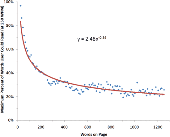
Internet users don’t really read content online, at least according to a study by Dr. Nielsen on reading behaviors of people on his website. His analysis shows that people only read 28% of the text on a web page and decreased the more text there is on the page.
 Source: Alertbox
To increase the likelihood of your readers getting the most out of your content, utilize techniques for making content easier to read. Highlight keywords, use headings, write short paragraphs, and utilize lists.
Your blog posts should be easy to skim, to the point, and be constructed instead of spewed. Unless that is what you are going for. Couple that point with...
7. Whitespace of Text Affects Readability
Easy readability of text improves comprehension and reading speed as well as enhancing the likelihood that a user will continue reading instead of abandoning the web page. There are many factors that influence ease of readability, including font choices (serif versus sans-serif), font-size, line-height, background/foreground contrast, as well as spacing.
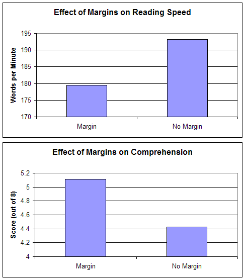
A study on readability tested reading performance of 20 participants by presenting them with the same text blocks having different margins surrounding the text as well as varying line-heights (the distance between lines of text). It showed that text with no margins was read faster, however, reading comprehension decreased. Faster reading speeds when the text had no margins can be explained by the text and paragraphs being closer together, resulting in less time needed to move the eyes from line to line and paragraph to paragraph.
 Source: Software Usability Research Laboratory
As this particular study shows, the way we design our content can greatly impact the user’s experience. Be wary of the details: color, line-heights, tracking, and so forth and be mindful of sound typography principles for the web to ensure that you’re not discouraging your users from reading your content. Furthermore, study the effective use of negative space in web design.
TL;DR - Walls 'o Text are not conducive to comprehension. So use whitespace, highlight important points, use headings, images, etc, get to the point and your readership base will appreciate it.
Source: Alertbox
Source: Software Usability Research Laboratory


There are probably also studies on white text on black vs black text on white background. I personally am in the Black on White camp, regarding websites, not regarding certain other things.
ReplyDeleteYeah.... I skim walls of text because they're unreadable messes.
ReplyDeleteOn my own blog I use images and sub-headings to break things up as much as possible.
I think Fiddler's Edge breaks almost every stylistic rule of proper blog writing. I should probably post a disclaimer - sort of "Trained verbalist posting on a closed course. Do not attempt 'wall of text' posting."
ReplyDeleteI'm in the white on black camp - so much so that I use the Stylish extension to firefox to "fix" certain blogs that I want to read regularly. The screaming white background is a strain on the eyes.
ReplyDeleteThe writing style of the author makes a difference. There are two eve bloggers I read most every post from that tend to write longer posts more towards the wall of text style. Both are good writers in my opinion; I enjoy both blogs and they both have interesting points of view to share. Both tend to use paragraphs rather than lists, headings, images, etc. But one strings the words and sentences together such that they "flow off the page" without a hardly any effort on my part. His choice of verbs, adjectives, and adverbs work together almost flawlessly. When reading the other's posts I find I have to back up from time to time to go over a bit again to be sure I got the point.
I agree with the point of Kirith's post, but for the one blogger I mentioned I hope he misses the post because I suspect he'd only diminish his work if he put too much effort into following that advice.