Back in the beginning of 2010
I tried out Star Trek Online and had this to say about the avatar part of the game:
I was disappointed with the character controls. The camera was annoying, turning in the direction I wanted to move instead of facing a single direciton... unless something was targeted which I didn't get at first. The animations looked... off. During one fight watching the NPCs bounce around like jackrabbits with springs in their boots to get over obstacles was very offputting. And I ran everywhere; dude slow down! It didn't look like a Triple-A game from 2010 in my humble opinion.
Then again, I just came off of finishing the awesome Batman: Arkham Asylum last week so maybe I'm just spoiled and STO is following MMO standards that I'm not used to because of Eve being so different. Also, I understand MMOs have to make allowances for network latency but still... I think they could do better.
So last night when I logged into Eve with the new Incarna build I was comparing Eve's version of an avatar to that in my head to start. Note: I did not try Captain's Quarters on Duality or Serenity.
Overall, I was impressed. The visuals were nice, the avatar was more lifelike than the dummies at STO, and the controls seemed natural to move around so far to a newb-to-avatars like me. In the ten minutes I putzed around I had no problems (i.e. bugs, lags, etc).
I need more time to give it a real workout but so far I'm giving Captain's Quarters an A for effort and a B+ for execution (the lower score reflecting the lack of things to do in this initial release).
Here are some screenshots.
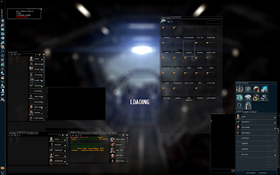 |
| Ok, I can do stuff while it loads... |
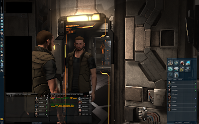 |
| Oh! There I am! Handsome devil... |
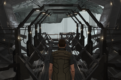 |
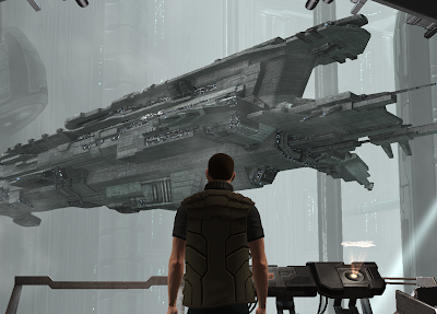
| Where's my ship? |
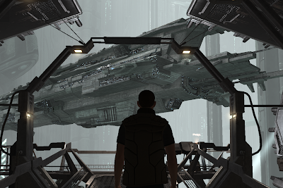 |
| Oh... there it is... jesus! Its HUGE! (That's what she said) |
 |
| So pretty... *sniff* |
 |
| Heroic Pose Wallpaper! |
As for the Noble Exchange and the crazy prices, I've heard rumours that they did the prices high on purpose to prevent a run on PLEXes and crazy price hike for them. I'm going to believe that because otherwise the prices are outrageous and unfeasible. Encourage people to buy many small inexpensive items, not big wallet-hemorrhaging items!


I totally agree, it's a good solid base from which to expand. It's a very slick interface and I'm sure will go a long way to removing that disconnected feeling that new players experience. I just hope that the development of additional features is a little quicker than the Incarna development cycle has been so far.
ReplyDeleteI'm not an economist so I have no idea about the science behind hilarious NeX pricing. It's quite entertaining to read all the doom-mongering from the Chicken Little forum brigade though. I just hope they're not right.
My theory about the high prices is they put them high to see if people would bite.
ReplyDeleteIf people pay $15 real money for a pair of pants then they don't have to lower the price. If they don't pay that much, then they can say "We've listened to our user base and have lowered the cost of vanity items."
Maybe I'm a little cynical. ;)
Did you notice that all of your ships appear at a similar size in the hanger? It's much less impressive when your Taranis looks the same size as your Thanatos... :P
ReplyDeletei want to spin ships!!!!!!!!!!!!!!!!!!!!!!
ReplyDeleteone other thing u can't just activate your ships dragging them from the ship inventory to the main view like before, and let me tell ya boy, you can lose some ship on the undock that way.